Crafting Brands That Connect: Logo and Brand Identity Design
A showcase of my expertise in creating visually compelling and memorable brand identities.
Table of Contents
Introduction
This page showcases my expertise in creating compelling and memorable logo and brand identity designs. I believe that a strong brand identity is essential for businesses to stand out and connect with their target audience. Each project featured here demonstrates my ability to develop unique and visually appealing designs that capture the essence of a brand and resonate with its intended audience.
1517 Summit Toronto
Design Approach:
The design approach for the "1517 Summit" logo effectively combines elements that represent the event's theme, location, and message. Here's a breakdown of the key design elements and their significance:
Symbolism:
Maple Leaf: The prominent maple leaf symbolizes Canada, the host country of the summit. It evokes a sense of national pride and unity.
Cityscape: The stylized cityscape skyline, featuring the CN Tower, represents Toronto, the specific location of the summit. It conveys a sense of urban dynamism and innovation.
Typography:
The bold, sans-serif font for "1517 SUMMIT" creates a strong visual impact and conveys professionalism.
The smaller, sans-serif font for "WILL TO POWER" provides a supporting message, emphasizing the theme of determination and ambition.
The use of uppercase letters for all text enhances readability and conveys a sense of authority.
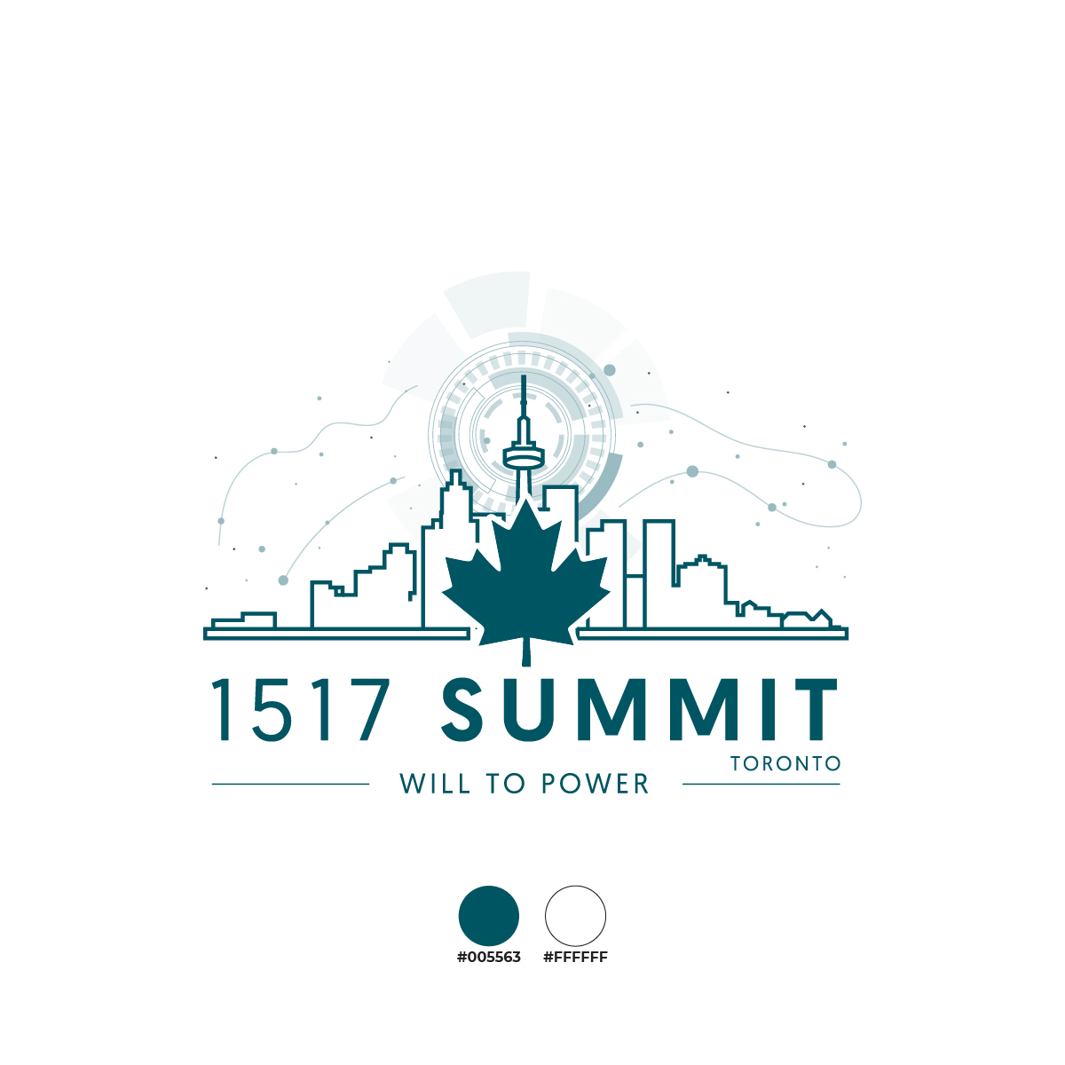
Color Palette:
The primary color, a deep teal (#005563), is associated with nature, growth, and stability. It evokes a sense of professionalism and trustworthiness.
The secondary color, white (#FFFFFF), provides a stark contrast and ensures readability. It also symbolizes purity and clarity.
Aranya Infra Ventures
Design Approach:
The logo design for "Aranya Infra Ventures" effectively combines elements of nature, architecture, and the company's mission. Here's a breakdown of the key design elements and their significance:
Symbolism:
House within Leaves: The central element of the logo, a house nestled within leaves, symbolizes the company's commitment to sustainable and environmentally friendly infrastructure development. It conveys the idea of creating living spaces that harmonize with nature.
Leaves: The leaves surrounding the house represent growth, vitality, and the natural world. They emphasize the company's focus on eco-friendly practices.
Typography:
The bold, sans-serif font for "Aranya Infra Ventures" creates a strong visual impact and conveys professionalism.
The use of uppercase letters enhances readability and conveys a sense of authority.
The tagline, "Where modern design breathes nature," is presented in a smaller, sans-serif font to provide additional context and reinforce the company's mission.
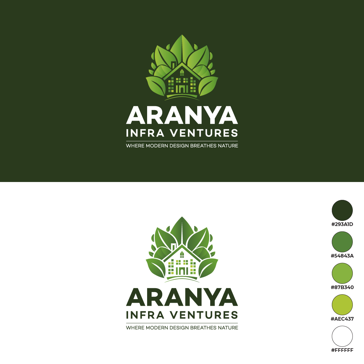
Color Palette:
The primary color, a deep green (#293A1D), is associated with nature, growth, and sustainability. It reflects the company's commitment to eco-friendly practices.
The secondary colors, #54843A, #87B360, and #AEC437, are shades of green that create a harmonious and visually pleasing palette. They further reinforce the company's connection to nature.
LeadZup
Design Approach:
The logo design for "LeadZup" effectively utilizes a combination of typography, color, and a simple geometric element to convey its brand identity. Here's a breakdown of the key design elements and their significance:
Symbolism:
The small, pixelated square element positioned before the brand name adds a touch of modernity and innovation. It suggests the idea of digital transformation and growth.
Typography:
The bold, sans-serif font for "LeadZup" creates a strong visual impact and conveys a sense of professionalism and confidence.
The consistent use of uppercase letters enhances readability and reinforces the brand name.
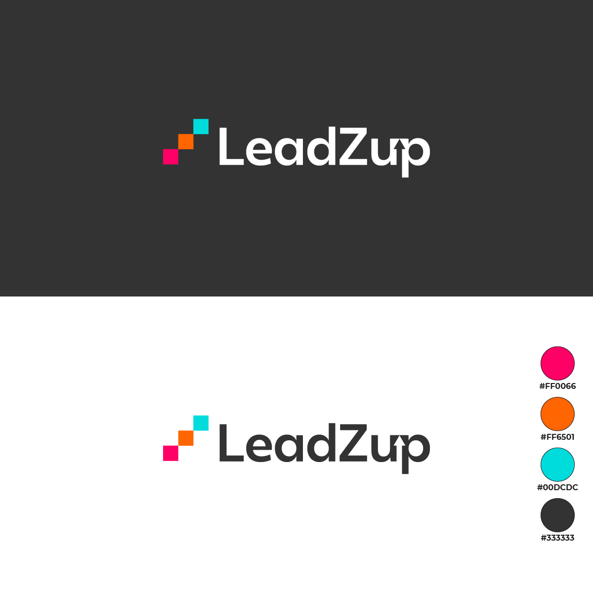
Color Palette:
The primary color, a vibrant pink (#FFD066), is associated with energy, enthusiasm, and excitement. It reflects the brand's dynamic and forward-thinking nature.
The secondary colors, orange (#FF6501), teal (#00DCDC), and black (#333333), provide contrast and balance while maintaining a cohesive overall aesthetic.
NoohArk - Tours and Travels
Design Approach:
The logo design for "Noohark Tours and Travels" effectively combines elements of travel, adventure, and local culture. Here's a breakdown of the key design elements and their significance:
Symbolism:
Taxi: The prominent taxi icon immediately conveys the company's transportation services and its focus on local tours and travels.
Mountains and Landscape: The background imagery of mountains and a scenic landscape represents the adventurous and exploratory nature of the company's tours. It suggests that Noohark offers trips to scenic and exciting destinations.
Stars: The stars add a touch of elegance and sophistication to the logo, suggesting a premium experience for travelers.
Typography:
The bold, sans-serif font for "Noohark" creates a strong visual impact and conveys professionalism.
The use of uppercase letters enhances readability and reinforces the brand name.
The phrase "Tours and Travels" is presented in a smaller, sans-serif font to provide additional context and clarify the company's services.
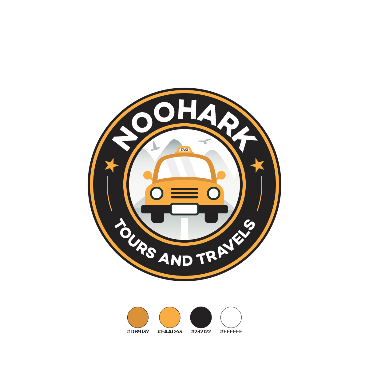
Color Palette:
The primary color, a vibrant orange (#DB9137), is associated with energy, adventure, and warmth. It reflects the exciting and adventurous nature of the tours offered by Noohark.
The secondary colors, black (#232122) and white (#FFFFFF), provide contrast and ensure readability.
Vision Gaming Studio
Design Approach:
The logo design for "Vision Gaming Studio" effectively combines typography, color, and a simple geometric element to convey its brand identity. Here's a breakdown of the key design elements and their significance:
Symbolism:
The stylized "plus" sign within the curved lines represents unity, connection, and collaboration. It suggests the idea of bringing people together through gaming.
Typography:
The bold, sans-serif font for "Vision" creates a strong visual impact and conveys a sense of professionalism and confidence.
The consistent use of uppercase letters enhances readability and reinforces the brand name.
The phrase "Gaming Studio" is presented in a smaller, sans-serif font to provide additional context and clarify the company's focus.
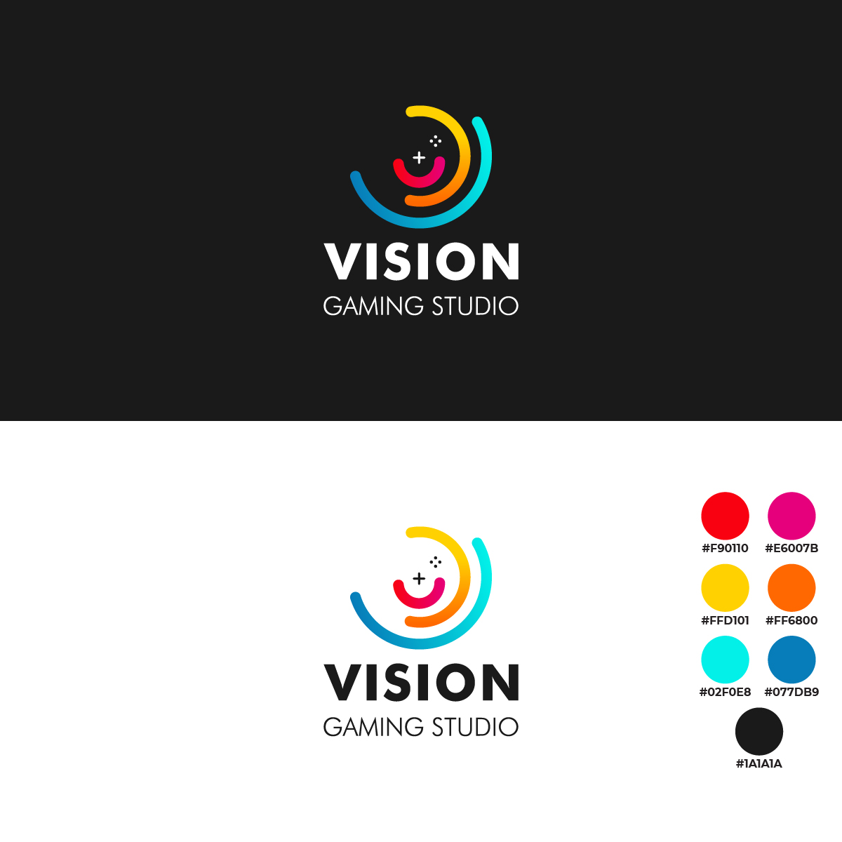
Color Palette:
The logo features a vibrant and diverse color palette, including pink, orange, yellow, teal, and blue. This reflects the dynamic and exciting nature of the gaming industry.
The colors are used in a gradient effect within the curved lines, adding depth and visual interest to the design.